A confident mark for Vietnam's premier build & operate partner.
— Brand identity / 2025
An identity system for a services firm helping international companies set up, hire, and operate in Vietnam. The mark, palette, and type pair carry credibility into a category dominated by faceless consultancies.

— Plate 01
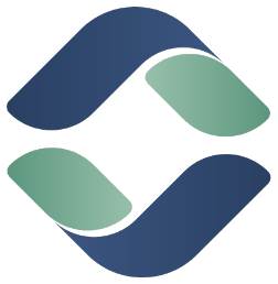
The symbol
Two leaves, one continuous flow.
The symbol reads as a stylised S, two interlocking leaf forms rotating around a shared center. It signals growth and partnership while staying abstract enough to scale from a favicon to a building sign.
01 — Form
Interlocking leaves
Navy and sage halves rotate 180° around a shared axis, balanced, never static. The negative space carries the motion.
02 — Meaning
Set up & operate
The unbroken S-path mirrors Avenir's promise: one continuous partner from entry to everyday operations.
03 — Behaviour
Built to scale
A near-square silhouette and bold strokes hold up in a 16px favicon and on a five-metre lobby wall alike.
— Plate 02
Construction
Geometry, clear space & minimum size.
The mark is built on a unit grid. Keep clear space of at least one leaf-width on every side, and never reproduce the symbol below its legibility floor.
Grid & clear space1× margin
↤ clear space ↦
↤ clear space ↦
Minimum sizesDigital / print
App · 84pxUI · 48pxFavicon · 24pxMin · 16pxNever reproduce the symbol smaller than 16px on screen or 6mm in print. Below that, the negative-space S closes up and the leaves merge.
— Plate 03
Logo system
One system, six lockups.
A horizontal primary for most contexts, a stacked variant for tight or square frames, reversed and one-colour cuts for constrained print, and a standalone app icon.
PrimaryHorizontal
StackedSquare frames

ReversedOn navy

One-colourMarine navy

MonoCarbon black
App iconStandalone
— Plate 04
Colour
A palette that reads credible, not corporate.
Marine navy anchors the system with institutional trust; sage adds warmth and growth. Carbon sets type, and a warm paper keeps everything from feeling cold or generic-blue.
Primary
Marine Navy
#31496F
Secondary
Sage
#7BAC96
Type
Carbon
#000000
Ground
Paper
#F4F0E8
Tint
Sage 60
#9CC4B1
— Plate 05
Typography
A heavy grotesque, tightly set.
The logotype is a custom-tightened grotesque at its heaviest weight: square, neutral and authoritative. The same family runs the system from headlines to fine print.
Logotype / display
Aa
WordmarkAvenir
HeadlineBuild & operate in Vietnam
BodyEntry, hiring, payroll & compliance
DetailEST. 2025 · HO CHI MINH CITY
— Plate 06
In application
The system, in the wild.
Stationery, signage and digital touchpoints share one disciplined rhythm: navy grounds, generous clear space, the symbol doing the talking.
AvenirLinh Tran
Director, Market Entry
linh@avenir.vn · +84 28 0000 0000
Business cardNavy / reversed
Office signageSymbol only

Brand photographyOn-brand imagery
Digital presenceEN / VI
— Plate 07
Misuse
Protecting the mark.
The symbol's balance is the whole point. Don't stretch it, recolour it off-palette, rotate it, or set it on a busy ground.
✕
Don't stretch
✕
Don't recolour
✕
Don't rotate
✕
No busy grounds
S
— On the brief
“In a category of faceless consultancies, the bravest move was to look like you'd actually take care of it.”
Avenir · Brand exploration · 2025