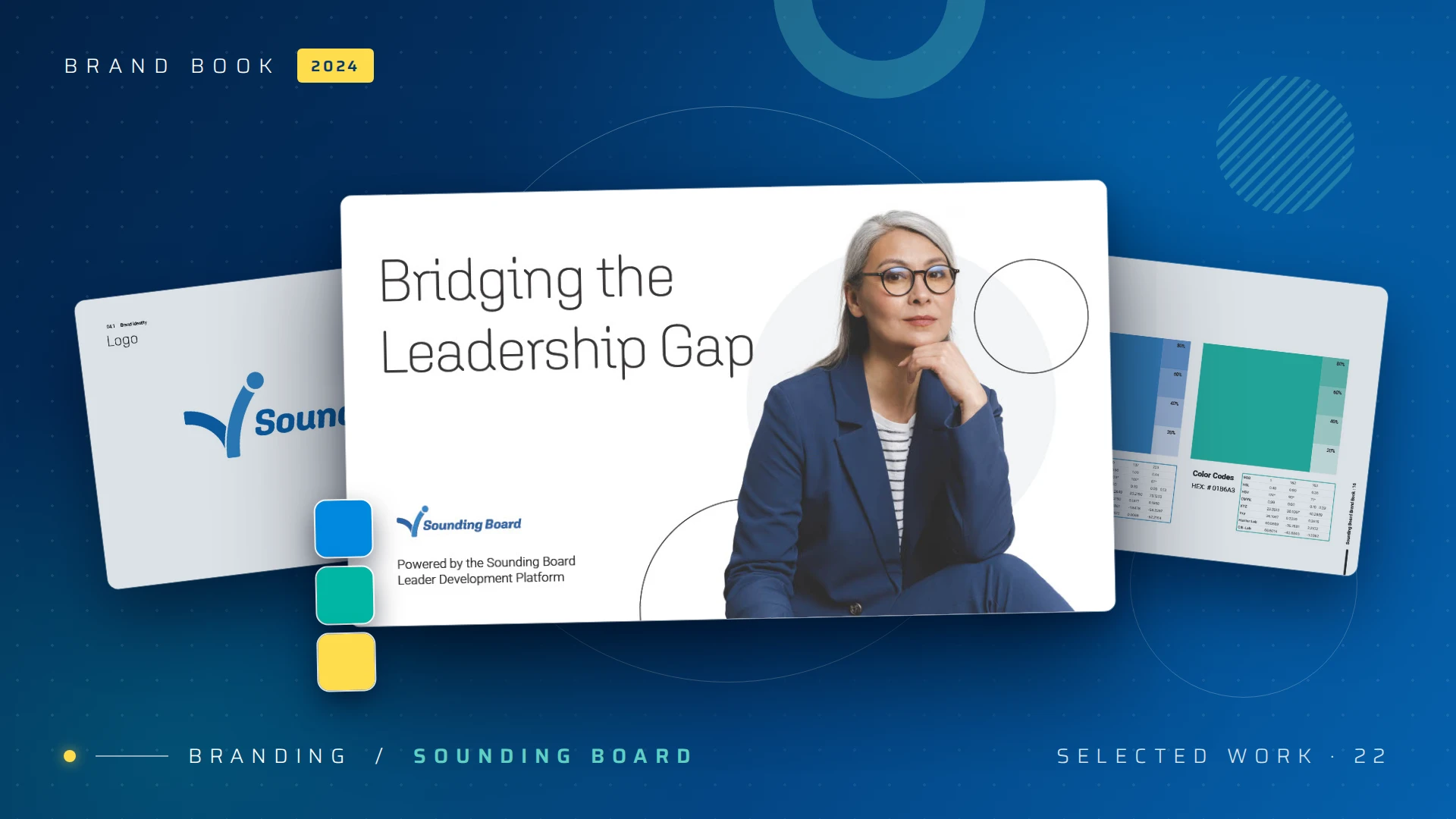
Revitalizing Sounding Board's brand to bridge the leadership gap.
— Brand identity / 2024
A confident, premium identity system that repositioned a leadership-development platform for top-tier global enterprises, including Intel, EY, and Cloudera. Brand voice, visual language, and design system, recalibrated end-to-end.
— 01 / The challenge
Why a system
Great social isn't one great ad. It's a system that never stops shipping.
Performance creative decays fast. An ad that crushed last month is invisible this week. Sounding Board needed a sustained, multi-channel paid presence across LinkedIn, Meta, and display, which meant producing dozens of fresh variants every quarter without burning the budget or letting brand quality slip.
The answer was to stop treating each ad as a one-off and design a kit: a small set of sharp message angles, each engineered to flow into every placement size, all locked to one unmistakable brand block. Here's how that campaign was built, and the principles behind it.
3
Distinct message angles, each tested against the others.
8+
Placement sizes per concept: feed, link, display, leaderboard.
240+
Creative variants shipped per quarter, on brand.
Design the idea once. Let the system carry it everywhere.
— 02 / Principle 01
One idea per ad
Lead with one idea, then say it three ways.
A great social ad makes a single point in the half-second before a thumb keeps scrolling. Rather than cram everything in, I split the message into three distinct angles, each aimed at a different buyer motivation. Running them against each other is what turns a campaign into a learning machine.

Angle 01 · Aspiration"How do you learn to be a better leader?" — speaks to personal growth.
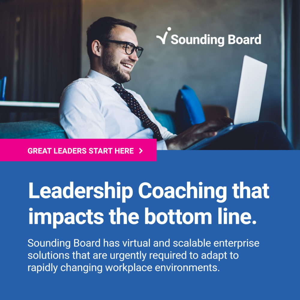
Angle 02 · ROI"Leadership coaching that impacts the bottom line." — speaks to the buyer's P&L.

Angle 03 · Talent"Employees want to be developed, not trained." — speaks to retention.
Three message angles — aspiration · ROI · talentClick to enlarge
— 03 / Principle 02
Format-native
One concept, every placement, each cropped to belong.
Each platform wants a different shape: a square for the feed, 1.91:1 for link previews, a tall-ish unit for in-stream, a sliver of a leaderboard at the top of a page. A great campaign doesn't squish one image into all of them. It re-composes for each, holding the message, the photo focus, and the brand block in the right place every time. Here's a single angle adapted across its full placement set.
Feed · 1:1
Link · 1.91:1
Display · 16:9
Banner · 2:1
In-feed · 1.2:1
Display · 1.91:1
Leaderboard · 8:1
Wide banner · 10:1
One angle — eight placements, re-composed not stretchedLinkedIn · Meta · Display
— 04 / Principle 03
Locked brand block
Velocity needs rules. Lock the brand, free the variants.
The only way to ship 240 variants a quarter and still look like one brand is to make the brand parts non-negotiable. Every ad carries the same fixed kit: the Sounding Board mark, the deep-blue message panel, the white headline type, and one magenta call-to-action that never changes its words. Designers compose freely around that block, never inside it.

Great Leaders Start Here ›
Anatomy — the fixed kit every ad inheritsLogo · panel · headline · CTA
Because the rules travel, the other two angles slot straight into the same placement system: instantly recognizable, never repetitive.


Same system, other angles — consistency at velocityConcepts 02 & 03
— 05 / Principle 04
Test & learn
Ship, measure, swap, repeat.
The system exists to be tested. Brand-narrative cuts run against direct-response variants; angles compete head-to-head; tired creative gets swapped before it drags performance down. Because production is templated, refreshing the feed is a swap, not a scramble, so spend always sits behind the best-performing idea.
— 01
Hook fast
One idea, legible in half a second, with the value up front, not buried under the fold.
— 02
Vary, don't drift
Rotate angle, photo, and crop freely; never touch the locked brand block.
— 03
Measure & retire
Let data pick winners. Kill fatigued creative early and reallocate to what works.
— 06 / Impact
What changed
Performance creative, made a system, not a scramble.
The kit sustained a multi-channel paid presence at brand-quality production speed, turning paid social from a recurring fire drill into a repeatable engine the team could run all year.
240+
On-brand creative variants per quarter.
3
Channels (LinkedIn, Meta, and display) from one kit.
8+
Placement sizes covered per concept.
1
Locked brand system holding it all together.
”
— The takeaway
A great social campaign is a system with a point of view, built to ship, test, and stay unmistakably on brand.
Peter Loebbecke · Sr. Creative Director