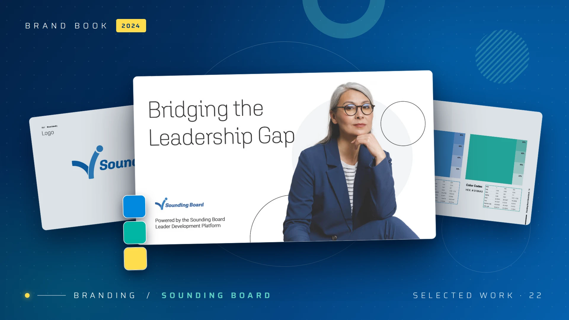
Revitalizing Sounding Board's brand to bridge the leadership gap.
— Brand identity / 2024
A confident, premium identity system that repositioned a leadership-development platform for top-tier global enterprises, including Intel, EY, and Cloudera. Brand voice, visual language, and design system, recalibrated end-to-end.
— 01 / The challenge
Who it’s for
Designed for the operations manager, not the designer.
IQConnect monitors fleets of networked printers and copiers across dozens of customer sites. The person watching it is a managed-print operations manager, not a power user looking for charts to admire. The telemetry arrives raw: meter reads, toner percentages, polling timestamps, hundreds of devices reporting at once.
Their real questions are short. What needs toner today? What stopped reporting? Where is waste hiding? The old workflow buried those answers in exports and spreadsheets. My job was to turn a wall of telemetry into one or two signals a manager can act on between phone calls, on a tired Tuesday afternoon.
The product’s job is to translate operational noise into action. KPI clarity over visual flourish, every screen.
— 02 / The brand
Identity & color
A mark built on connection.
Before the dashboard, the product needed an identity. IQConnect watches connected fleets, so the mark is built from two interlocking loops: the device and the platform, locked together in one continuous link. Black carries the IQ; a single confident blue carries the connection. No circuit-board clichés, no wireless arcs.
The system ships in two lockups: a vertical stack for app icons and product surfaces, and a horizontal lockup for marketing. That same blue, #157FA4, became the product’s primary color, the spine the whole interface hangs on.
Vertical lockup · product
IQConnect
Horizontal lockup · marketing
IQConnect
Logo system — two-variant lockupSee the full identity →
Color does the work.
Beyond the brand blue and black, the interface runs on a three-state signal: green for healthy, amber for caution, red for action needed. Toner uses true CMYK swatches, so a manager reads a supply row the way they think about a cartridge. In this product, color is information, not decoration.
PrimaryConnect Blue#157FA4
NeutralBlack#000000
HealthyAbove 50%#7CB342
Caution30–50%#F2B705
ActionBelow 30%#E0533D
Cyan#00AEEF
Magenta#EC008C
Yellow#FFCE00
Black#222222
— 03 / The dashboard
Home view
One screen, four answers.
The home view answers the manager’s first four questions before they scroll: how many devices are healthy, how many need watching, how many need action, and how much is being wasted. Each number is a ring sized to read from across a desk. Below, two charts give context: page volume over time, and the color, mono and digital split that drives cost.
app.iqconnect.io/dashboard
IQConnect
Search by serial #
560
213
53
Hello, David Richardson
DR
Above 50% · mean value
560
67.3% of total
Caution · 30–50%
213
25.7% of total
Warning · below 30%
53
6.4% of total
Waste
11%
of total usage
Printed pages
Printed pages in 1,000s
Color / Mono / Digital
ColorMonoDigital
Home dashboard — fleet health at a glanceFigma · recreated in browser
— 04 / Working views
Supply, missing, world
From the overview to the row that matters.
The dashboard sets the priority; the working views close the loop. Each one strips to a single job, keeps the persistent search and signal tally, and turns a question into a short list a manager can act on.
app.iqconnect.io/supply-report
IQConnect
Search by serial #
56021353
Hello, David RichardsonDR
| Customer | Model | Serial # | Last polled | Cyan | Mag. | Yel. | Black | Waste | Days last order |
|---|---|---|---|---|---|---|---|---|---|
| BestLife | WorkCentre 3320/DN8 | LA228084 | 6 | 62 |
48 |
71 |
24 |
9 |
48 |
| BestLife | WorkCentre 3320/DN8 | LA226808 | 14 | 18 |
35 |
52 |
61 |
12 |
21 |
| BestLife | WorkCentre 5955/APT | LA228615 | 3 | 88 |
74 |
66 |
80 |
4 |
62 |
| Paradise | WorkCentre 3320/DN8 | LA224061 | 9 | 41 |
9 |
57 |
33 |
15 |
30 |
| Paradise | WorkCentre 5955/APT | LA228440 | 11 | 54 |
63 |
22 |
46 |
7 |
18 |
Supply Report — every cartridge as a scannable CMYK levelReorder becomes a short list
app.iqconnect.io/missing-machines
IQConnect
Search by serial #
56021353
Hello, David RichardsonDR
| Customer | Model | Serial # | Quiet | IT contact | Site contact | Location |
|---|---|---|---|---|---|---|
| BestLife | WorkCentre 3320/DN8 | LA226808 | 14 days | it@bestlife.com | Trevor | Los Angeles, CA |
| BestLife | WorkCentre 5955/APT | LA228615 | 12 days | it@bestlife.com | Trevor | Los Angeles, CA |
| Paradise | WorkCentre 3320/DN8 | LA224061 | 11 days | it@paradise.com | Marisol | San Diego, CA |
| Paradise | WorkCentre 5955/APT | LA228440 | 11 days | it@paradise.com | Marisol | San Diego, CA |
| Northgate | WorkCentre 3320/DN8 | LA229017 | 19 days | it@northgate.com | Dana | Phoenix, AZ |
Missing Machines · devices gone quietA gap in data becomes a phone call
app.iqconnect.io/world-view
IQConnect
Search by serial #
56021353
Hello, David RichardsonDR
HealthyCautionAction
ClientParadise
Machines142
Action needed9
LocationSan Diego, CA
World View — the fleet by territory, color-coded by healthRegional health at a glance
— 05 / Mobile
The fleet, in a pocket
Operations doesn’t happen at a desk.
Managers walk floors, sit in trucks, take calls between sites. The mobile views keep the same signal system and strip each screen to the one decision it serves: the morning health check, a device’s toner levels, the list of machines gone quiet. Thumb-reachable, glanceable, the same language as the desktop.
9:41
Home
Missing machines
5 devices quiet beyond 10 days
WorkCentre 3320/DN8
LA226808
BestLife · Los Angeles, CA
Call IT contact
WorkCentre 5955/APT
LA228615
BestLife · Los Angeles, CA
Call IT contact
WorkCentre 3320/DN8
LA224061
Paradise · San Diego, CA
Call IT contact
Mobile views — health check, toner detail, machines gone quietSame signal system, one decision per screen
— 06 / Impact
What changed
Clarity became the operating principle.
The work established the design system the product team continues to ship through: a shared library of KPI rings, chart cards, tables, and the green-amber-red signal language. Decisions that used to take an export and a spreadsheet now happen on the home screen. KPI clarity over visual flourish stopped being a preference and became the rule.
4
Fleet answers surfaced before the first scroll.
5
Core views from one component system.
3
State signal language used across every screen.
1
Design system the team still ships through.
”
— The takeaway
A monitoring tool earns its keep in the first three seconds. If the manager has to hunt, the design has already failed.
Peter Loebbecke · Sr. Creative Director